02 — Case study
PETVORA
- Client
- PETVORA
- Year
- 2026
- Services
- BRAND IDENTITY / PACKAGING
The challenge
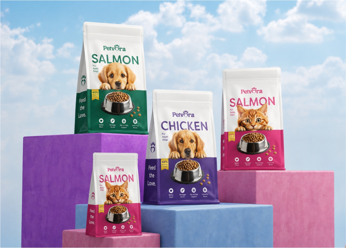
Pet food brands often look the same. The goal was to create a warm, playful identity that feels instantly recognizable and emotionally connected to pets.
The idea
Build the identity around a simple visual language of heart + paw, combining affection, care, and companionship into one memorable mark.
The system
01
Logo
A heart and paw-inspired symbol expressing love, trust, and companionship.
02
Typography
Bold, rounded type creates a friendly and approachable personality.
03
Colour
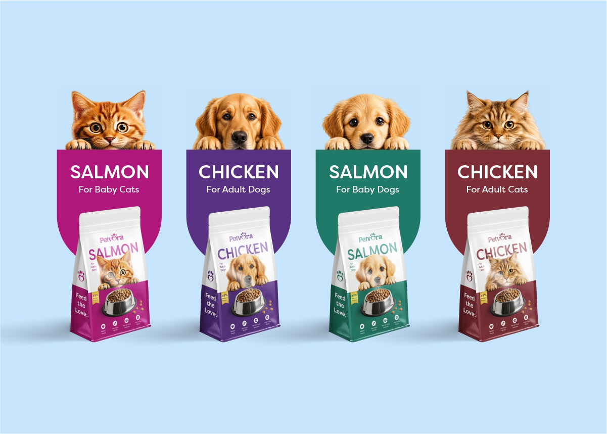
Bright, playful colours bring warmth and strong shelf presence.
04
PACKAGING
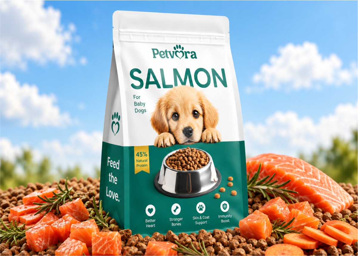
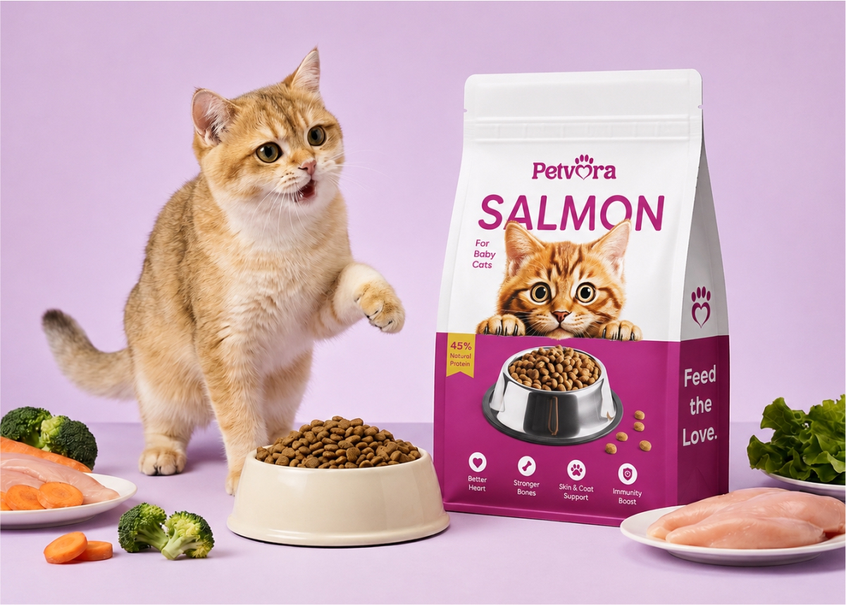
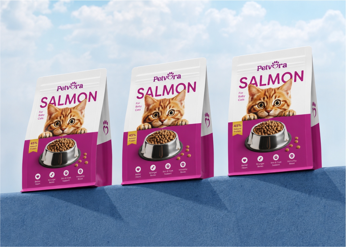
Packaging designed to stand out, connect with customers, and make the brand unforgettable.
05
GRAPHIC LANGUAGE
Simple shapes and playful elements create a flexible, recognizable system.
The result
A joyful identity that feels caring, distinctive, and unmistakably pet-friendly.