03 — Case study
ARJEV
- Client
- ARJEV
- Year
- 2025
- Services
- BRAND IDENTITY
The challenge
ARJEV needed a visual identity that could balance innovation, elegance and professionalism while still feeling warm and approachable. The challenge was to create a distinctive brand system that communicates quality, trust and design excellence across every touchpoint, without feeling overly complex or conventional.
The idea
Build ARJEV’s identity around innovation, elegance, professionalism and approachability. Every visual element is designed to reflect the brand’s commitment to superior construction and thoughtful design, while creating a strong sense of trust, warmth and confidence.
The system
01
Logo
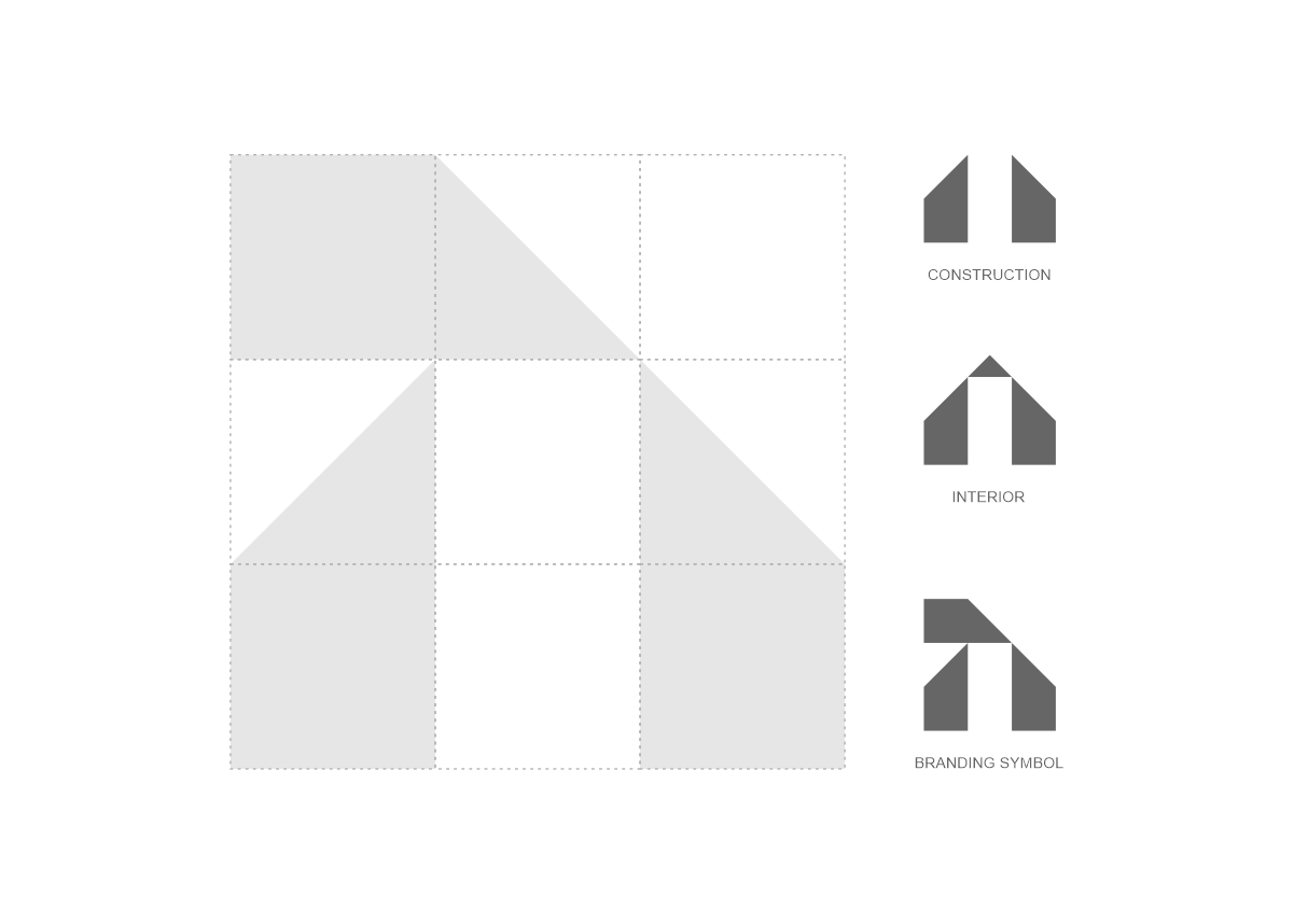
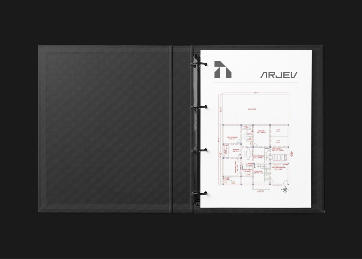
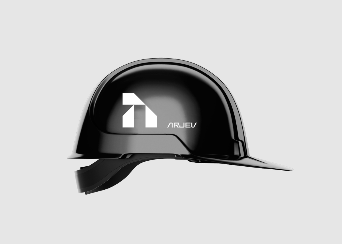
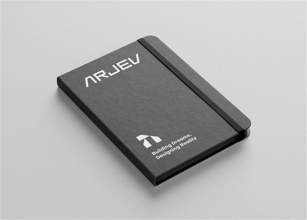
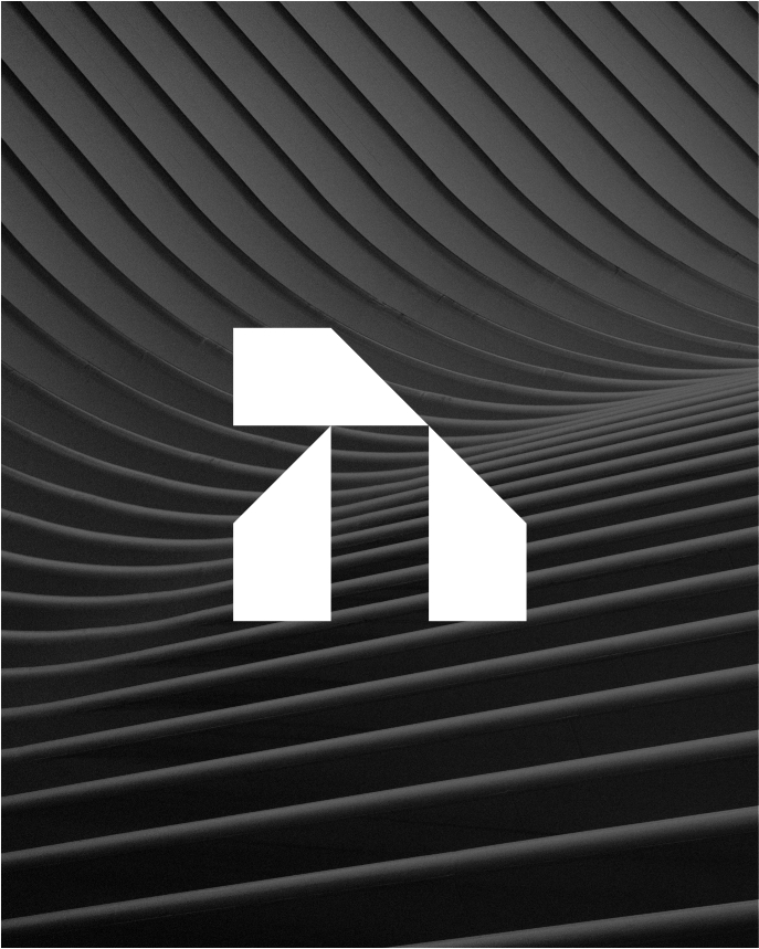
A refined and distinctive mark that represents ARJEV’s commitment to quality, precision and progressive design.
02
Typography
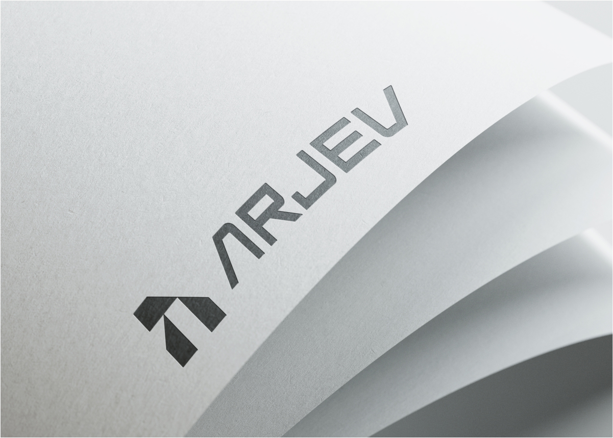
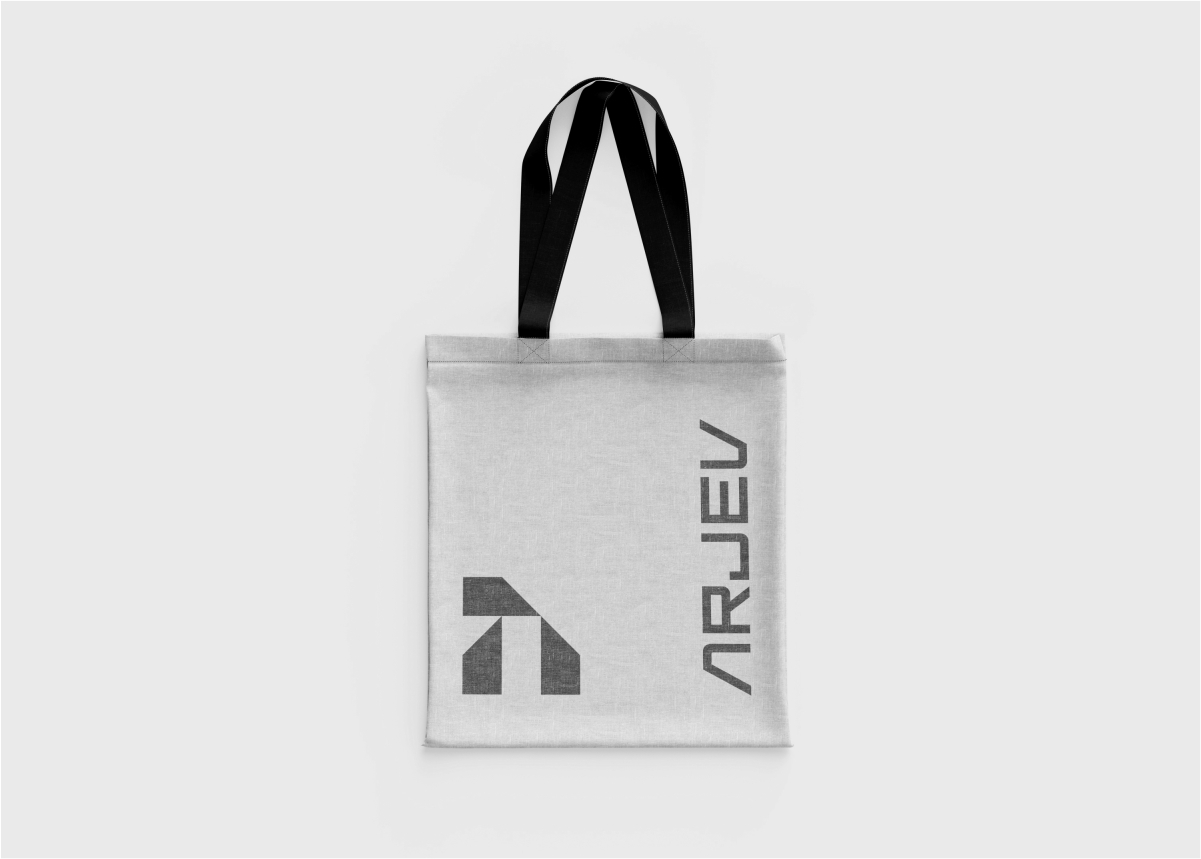
A modern, clean sans-serif typeface brings clarity and timelessness, with subtle customization adding a unique and sophisticated character.
03
Colour
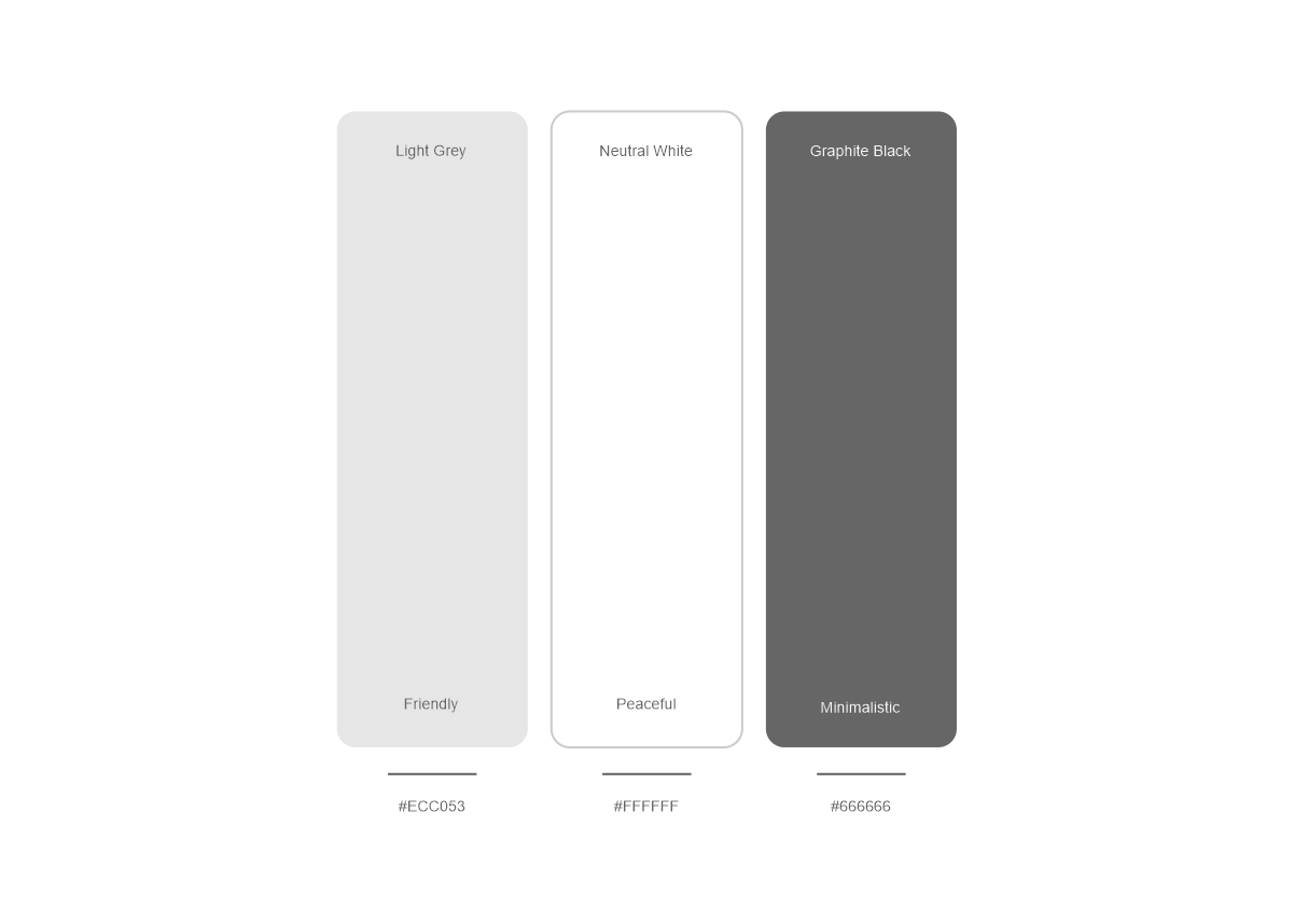
A considered colour palette creates a balance between professionalism, elegance and warmth, giving the brand a confident yet approachable presence.
04
ART DIRECTION
A clean, architectural visual language highlights craftsmanship, material quality and contemporary spaces, reinforcing ARJEV’s design-led approach.
05
Social
A consistent social media system brings ARJEV’s identity to life through clean layouts, strong typography and refined architectural imagery. The approach keeps every communication professional and recognizable while allowing enough flexibility for projects, brand stories, announcements and design-led content.
The result
A cohesive and timeless identity that positions ARJEV as a trusted, design-focused construction brand combining innovation, precision and elegance within one consistent visual system.