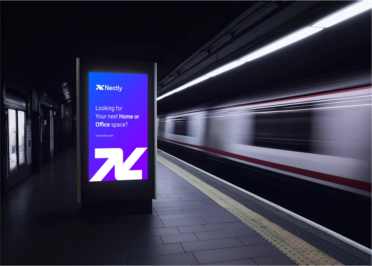
04 — Case study
NESTLY
- Client
- NESTLY
- Year
- 2026
- Services
- LOGO IDENTITY
The challenge
Nestly needed an identity that could communicate movement, connection and trust in one simple, memorable system. The challenge was to create a visual language that felt modern and dynamic, while still conveying the stability and confidence people need when finding and connecting with spaces.
The idea
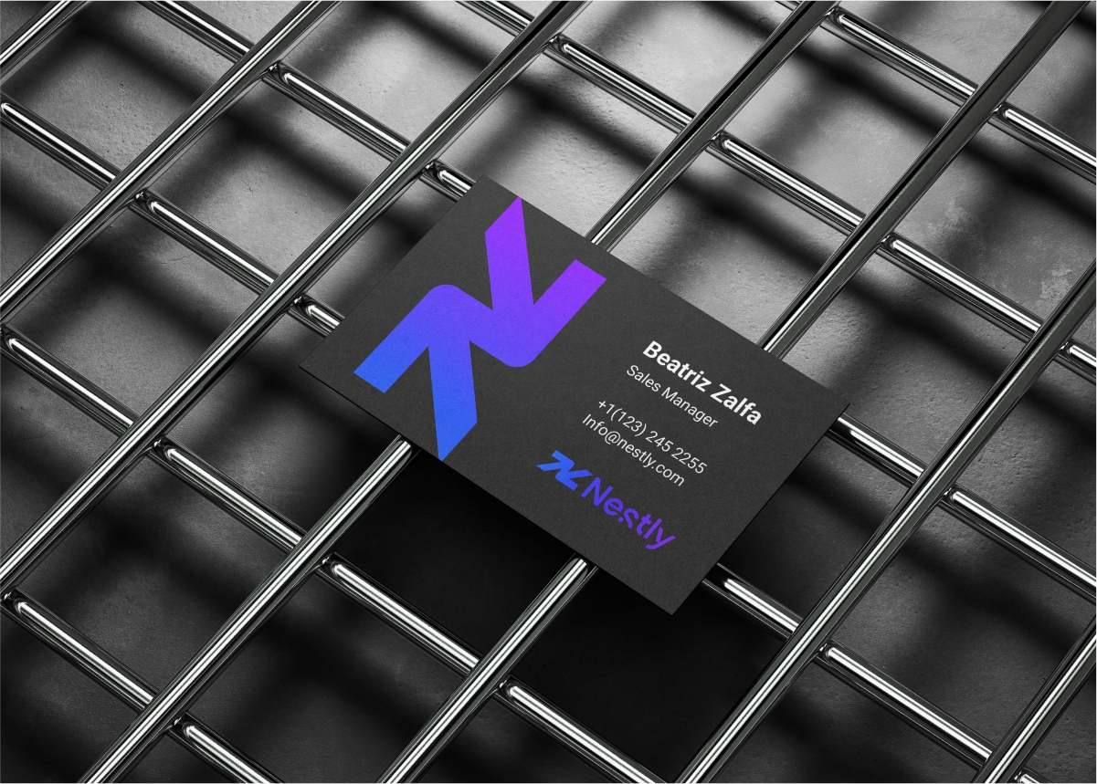
Build Nestly’s identity around a symbol that combines the letter “N” with upward and downward arrows expressing movement, connection and balance. The upward direction represents growth and progress, while the downward direction communicates stability and trust.
The system
01
STRUCTURE
A distinctive “N” symbol designed from directional arrows, creating a memorable mark for movement and connection.
02
Typography
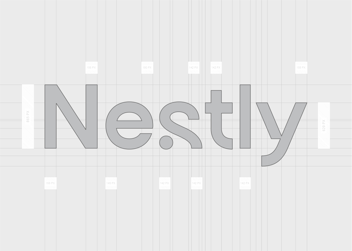
Clean, modern typography keeps the identity approachable, confident and easy to recognise.
03
Colour
A balanced colour system reinforces Nestly’s modern, trustworthy and people-focused personality.
04
Photography
Visuals focus on spaces, movement and human connection, bringing the idea of belonging to life.
05
Retail
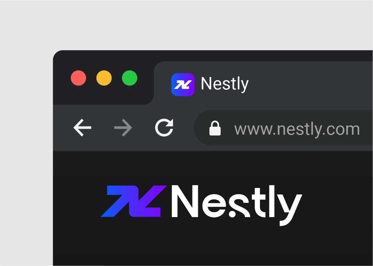
A flexible graphic system allows the brand to communicate consistently across digital and social platforms.
The result
A clear and scalable identity that reflects growth, stability and connection helping Nestly create a space where people can find, connect and move with confidence.