01 — Case study
AUREN
- Client
- AUREN
- Year
- 2025
- Services
- BRAND IDENTITY
The challenge
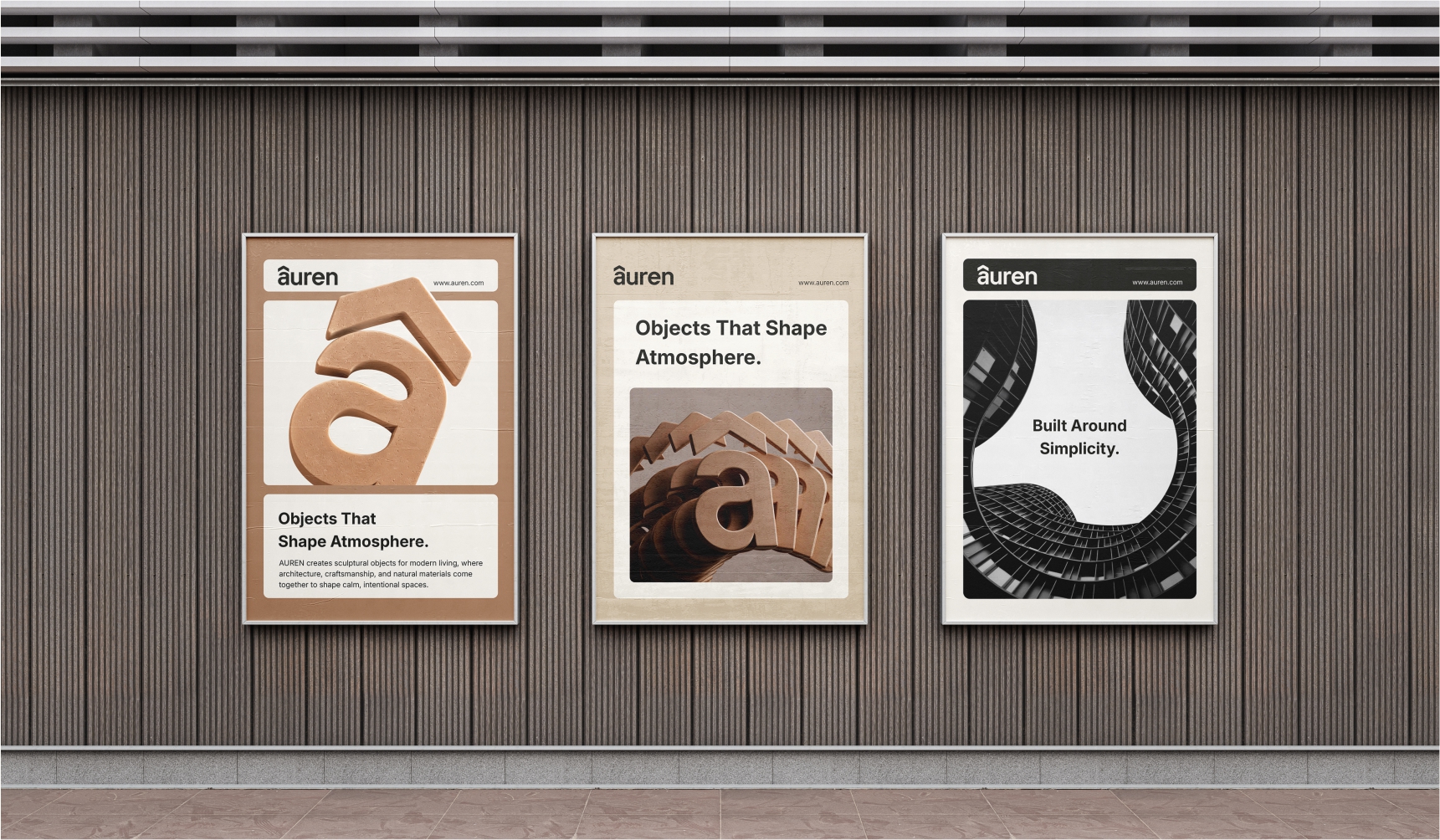
AUREN needed a visual identity that could express modern premium living while feeling warm, architectural, and distinctive. The brand required a system strong enough to work across products, packaging, interiors, signage, and digital platforms.
The idea
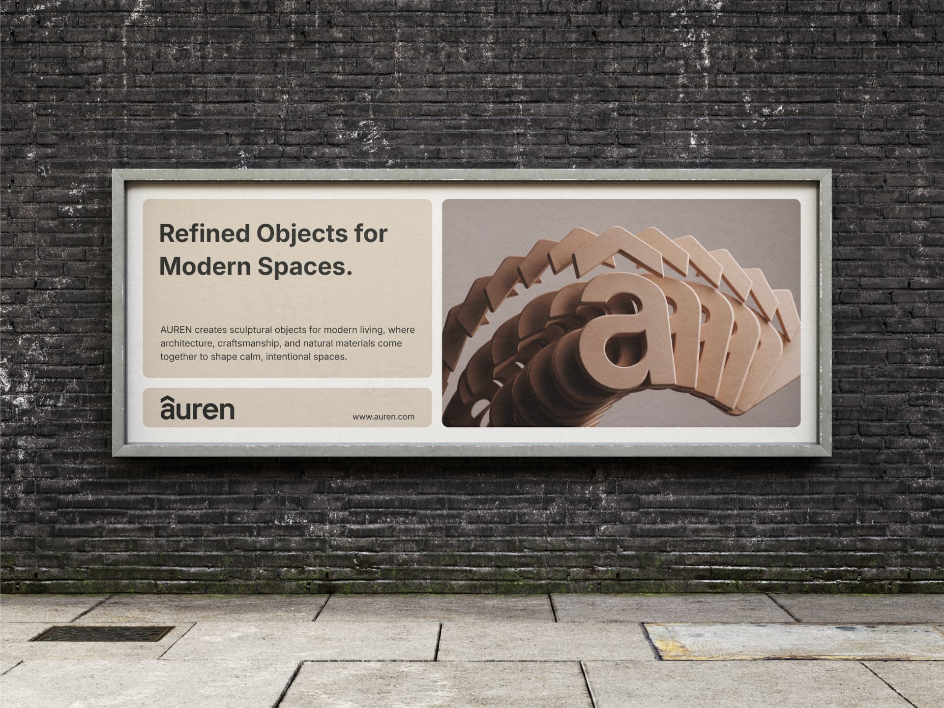
Build the identity around the idea of “a thoughtfully designed space.” A bold lowercase wordmark brings confidence and approachability, while the geometric symbol creates a visual connection to architecture, shelter, entrances, and contemporary living.
The system
01
Logo
A bold contemporary sans-serif wordmark gives AUREN a confident yet approachable personality. The lowercase construction adds warmth and modernity while maintaining a premium presence.
02
Typography
Clean, contemporary sans-serif typography supports the architectural character of the identity. Strong weights create confidence, while restrained layouts maintain a refined premium feel.
03
Colour
A sophisticated, minimal colour system keeps the brand timeless and design-led. The palette allows products, materials, and interior environments to remain the visual focus.
04
BRANDING
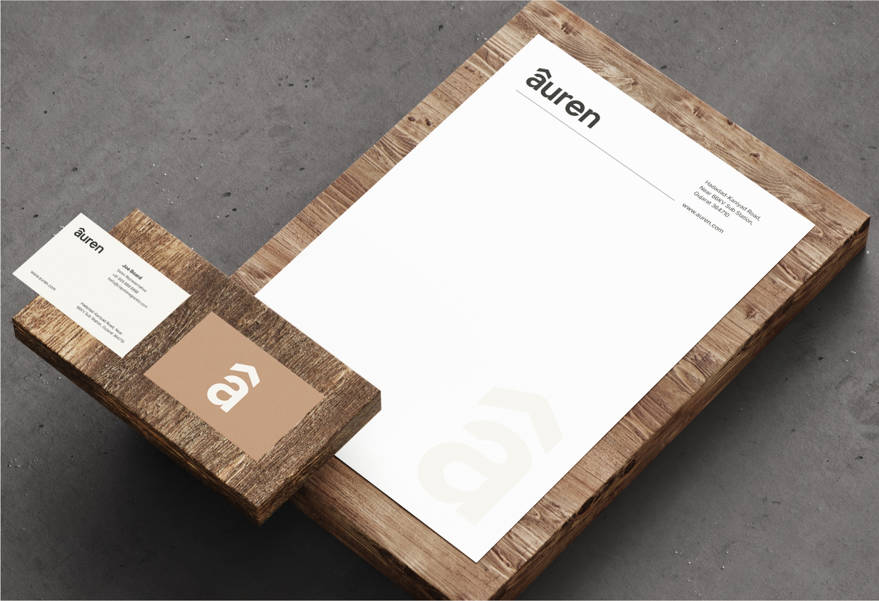
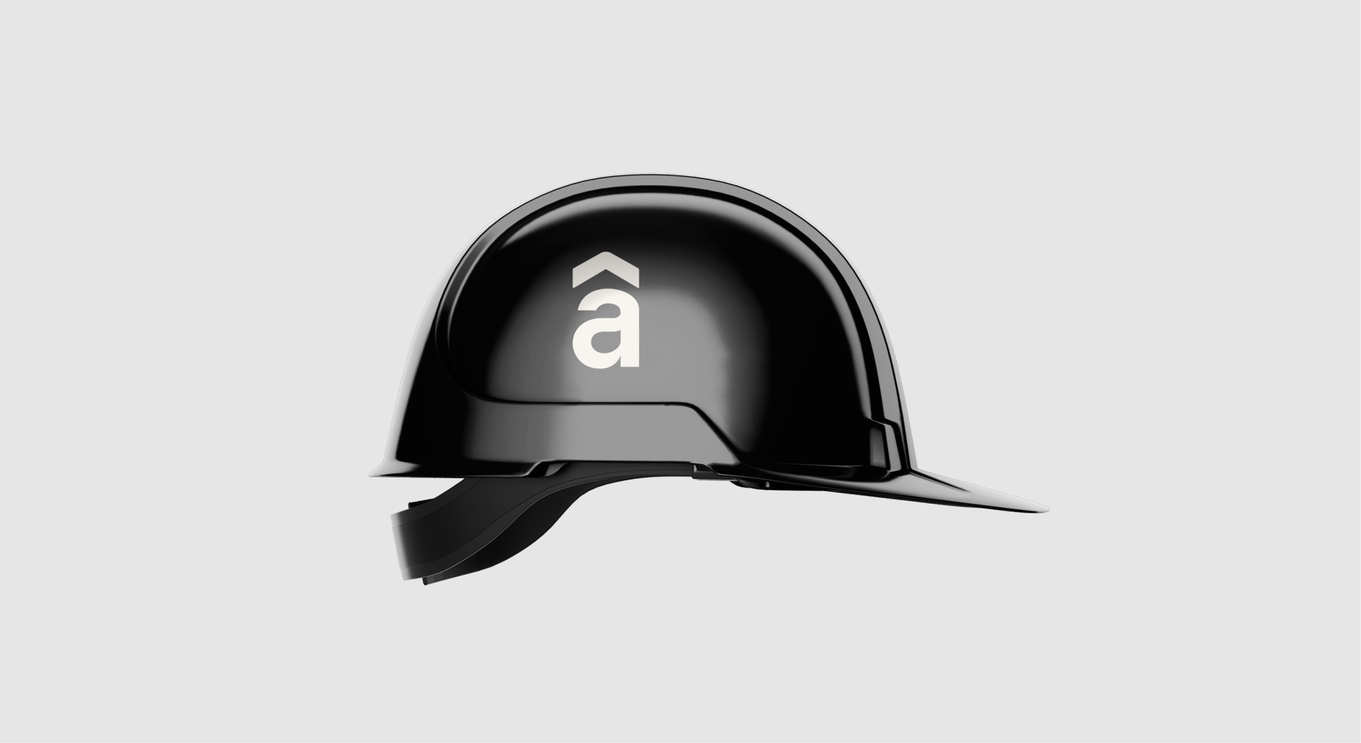
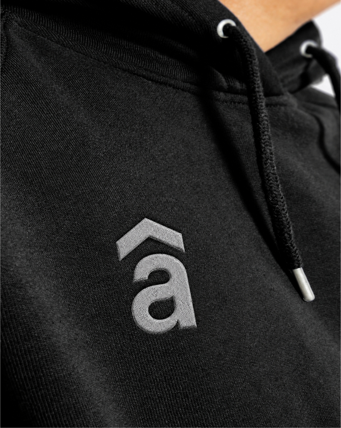
The identity translates into minimal, structured branding where typography, spacing, and the AUREN symbol create a consistent premium presentation across every product.
05
Digital
The simplified symbol and clear wordmark are designed to remain distinctive across websites, social media, digital campaigns, profile icons, and other small-format applications.
The result
A cohesive identity system that positions AUREN as a modern premium lifestyle brand rooted in architecture, calm spaces, and thoughtful design — consistent across physical and digital touchpoints.